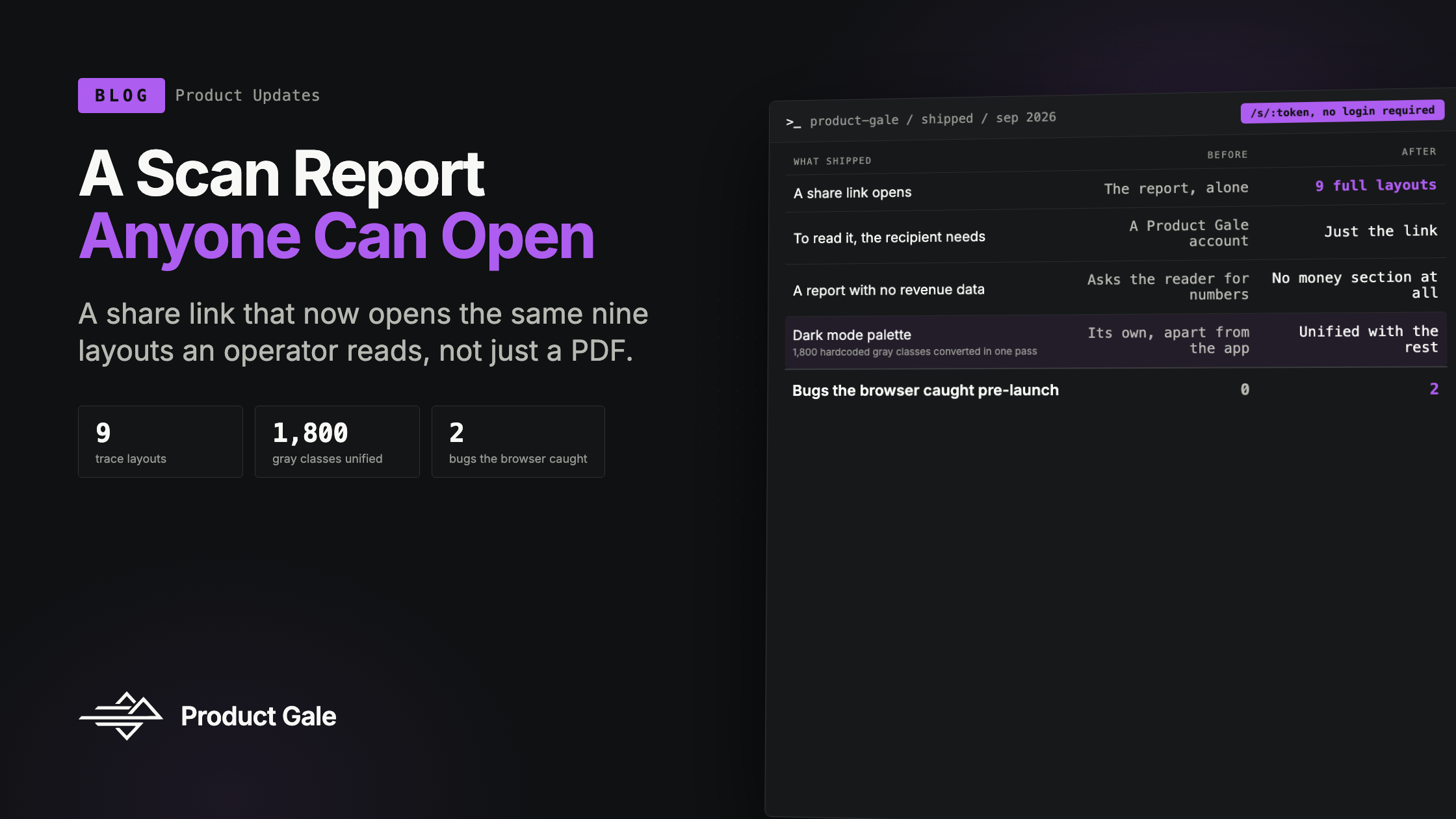
New in Product Gale: A Scan Report Anyone Can Open
What shipped over the last two weeks: a share link that opens the full report for someone with no account, a document redesigned to be sent cold, nine ways to look at one trace, and the two bugs the browser caught before a customer did.
Product Gale Team
New in Product Gale: A Scan Report Anyone Can Open
Until two weeks ago, sending someone a scan meant sending a PDF and hoping they had questions we could answer later. The PDF was the whole product they got. Everything we actually measured, the nine layouts an operator reads to understand a trace, lived behind a login the recipient didn't have.
That's fixed now, and fixing it forced a few other things to get fixed along with it.
A link that opens the real thing
A share link used to point at /r/:token, which renders the report document and nothing else. It still does exactly that, unchanged, because it's also the page our PDF pipeline prints and because links minted before this had to keep working.
What's new is /s/:token. It opens the same nine layouts an operator gets when they open a trace, with Open report and Download PDF sitting on top as actions rather than as the only two things on the page. A prospect can now go look at the waterfall, or the span explorer, or the event ledger, on the page you sent them, without an account.
Two things had to change before a stranger could actually see any of that. The trace replay fetches the captured screenshot from an authenticated route; it now accepts an optional image source instead, the same shape ReportEvidence has taken since an earlier release. And three of the nine layouts carried an "Add your numbers" link into /workspaces, which asks a session the reader doesn't have to open a workspace that isn't theirs. A test asserting the public page carries no internal link is what caught it, not a person clicking around.
What we now know about who reads it
Sending the link is not the interesting part. Knowing what happened after is.
The share page now reports which of the nine layouts got opened, whether the reader took the PDF or the document, and how long it stayed visible, paused while the tab is hidden so a forgotten browser tab in the background doesn't count as an engaged reader. Duration is sent as it accumulates rather than saved for the moment the tab closes, because unload is the least reliable event a browser offers.
Building that beacon surfaced two bugs the browser found that our tests hadn't. React's development double-invoke calls a cleanup function once for practice; ours stopped the beacon outright, which silenced it for the rest of that page's life. The fix was to pause the beacon instead of stopping it, with a test that runs under StrictMode and fails against the old code. The same double-invoke also fired the "opened" event twice for one person opening the link once, so opens are now deduplicated by visit rather than counted per event.
The operator's panel shows who read a shared report, from where, on what device, and for how long, and lists a messaging app's link preview as a preview rather than as a reader. When a read can't be attributed, the panel says nothing, on purpose. "Nobody has opened this yet" and "we couldn't tell you if they did" are different facts, and collapsing them into one silent row would have been the easier thing to build.
From an app screen to a document
The report itself needed to stop looking like a screenshot of software.
It's a letterhead now: the Product Gale mark over a rule, the store name and the day, the finding stated as a headline, and a band of the measured numbers behind it. The money section keeps its card when a number was actually measured for that scan; when there isn't one, it collapses to a single operator-only hint that's hidden from print entirely; a PDF sent cold simply has no money section rather than a card asking the recipient to type in revenue for a workspace they don't have. All six section headings now pull from one shared style module, and the document signs off with who prepared it, the way a document does and a dashboard doesn't.
That redesign then got its final pass under a chosen visual direction we're calling Signal: the mark appears in ink on the letterhead and small in the footer, sections open on hairline rules under sentence-case headings, the tables run one step denser so five columns still fit on an A4 page, and verdict words carry their meaning in color, emerald or amber, instead of sitting there as plain text next to everything else. On screen the report sits as a bordered sheet on the app's background; in print it's a plain A4 page. No copy changed and the PDF pipeline is untouched, which was the point: the words didn't need to move, only how they're framed.
Also shipped this cycle
A few smaller things landed alongside the two above:
- Nine layouts, one shared source of truth. The trace page now shows a selected trace as a tab strip: span explorer, build log, issue and properties, audit score, event ledger, waterfall, the replay, the written report, and the data loss report. Every tab reads its numbers from the same module, so no two tabs can disagree about a count, and a trace missing a measurement renders fewer rows rather than a placeholder row pretending to have one.
- A verdict fix that had been showing customers a debug string. The span explorer was rendering a trace's outcome as
won · competitor_named: nullin one place and a lowercase word plus a raw field in another. Both now use the same phrased sentence every other layout in the product already uses. - One dark mode instead of two palettes pretending to be one. Dark mode was blue-gray cards on a gray-900 background while the trace layouts we'd already shipped used a different, near-black palette with a violet accent. The tokens are unified now, light and dark are the same design at two exposures, and around 1,800 hardcoded gray utility classes across the app converted in a single pass because they were re-based onto the same scale. Two real bugs rode along for free: a hover style referenced everywhere in the app was never actually defined, so it had been silently compiling to nothing, and white text on a violet-400 fill failed contrast badly enough to fix outright.
- A sidebar that stays out of the way. Navigation panels now start closed, except the one containing whatever page you're already on, so the row for where you are is never hidden behind its own collapsed header.
Why this batch, together
None of these shipped as one project. They shipped as one project once we noticed they were the same project: a report that used to prove things only to someone already logged into Product Gale now has to prove them to someone who has never heard of us and received a link in an email. Everything above, the public route, the read receipts that don't overclaim, the letterhead, the denser tables, the fixed verdict copy, is in service of the same sentence: the report should stand on its own when we're not in the room to explain it.
Want to see it land in your own inbox? Ask us for a scan, and we'll send you the link, not just the PDF.
Keep reading
A Measurement-First Architecture for AI Shopper Observability
How Product Gale agent scans bound the cost of reading a product page, attribute latency to named segments, and prove where each fact came from. Includes the 9.27-second instrumentation defect, the 340% capture error, and the measurements behind both.
AI Shoppers Are Already Buying: Your Analytics Just Can't See Them
AI referral traffic to ecommerce grew 4,700% year over year and now converts better than traditional search. Here's why almost none of it shows up in your reports, and what that blind spot costs.